The Best Fonts, Layouts and Formatting for Sales Proposals
Most businesses focus heavily on proposal content but underestimate how much design and formatting influence customer perception.
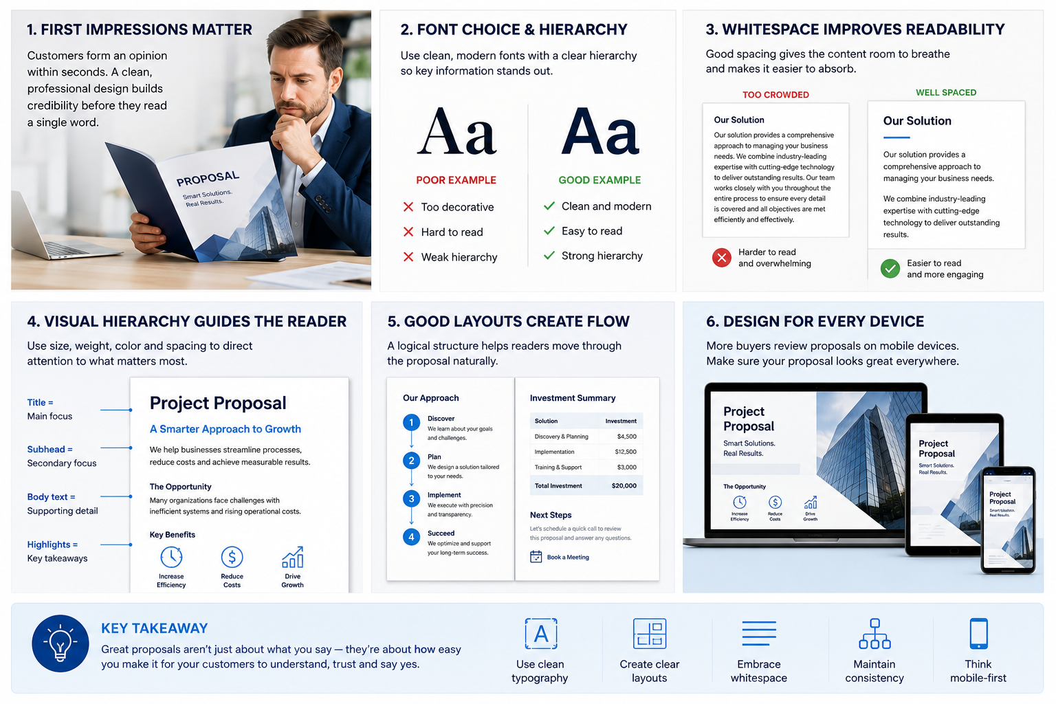
Before a customer fully reads a proposal, they are already making subconscious judgements about professionalism, clarity, trustworthiness and perceived quality based on the visual presentation alone.
Fonts, spacing, layout structure and formatting all affect how comfortable a proposal feels to read. Poor formatting increases friction and cognitive fatigue. Strong formatting creates clarity, confidence and a smoother buying experience.
In many cases, proposal design directly influences whether customers engage properly with the content or simply skim through it looking for pricing.
Proposal Design Is Really About Readability
One of the biggest mistakes businesses make is treating proposal design as purely visual branding. While branding matters, the primary purpose of proposal formatting is actually readability.
Customers are often reviewing proposals under time pressure while comparing multiple suppliers at once. If the document feels difficult to navigate or mentally exhausting to process, engagement drops very quickly.
Strong proposal formatting reduces cognitive load. It guides the reader naturally through the information while making key points easy to absorb quickly.
The best proposals feel visually calm, structured and easy to follow.
Why Font Choice Matters More Than Most Businesses Realise
Fonts influence readability, emotional tone and perceived professionalism. Many businesses either overcomplicate typography or rely on outdated font styles that unintentionally make proposals feel old-fashioned.
In most modern proposal environments, clean sans-serif fonts tend to perform best because they are easier to read digitally across desktops, tablets and mobile devices.
Fonts such as:
Inter, Open Sans, Helvetica, Roboto, Lato and Source Sans Pro are commonly used because they balance readability with a modern professional appearance.
Serif fonts can still work well in certain luxury, legal or editorial-style proposals, but overly decorative typography usually reduces clarity rather than improving presentation.
Good typography should feel almost invisible to the reader. The customer should focus on understanding the message, not noticing the font itself.
Consistency Creates Professionalism
One of the quickest ways to weaken a proposal visually is inconsistent formatting.
Random font sizes, mismatched spacing, inconsistent heading structures and poorly aligned sections create subtle visual tension that makes documents feel less trustworthy and less professionally prepared.
Customers may not consciously identify these issues, but they still affect perception psychologically.
Strong proposals use consistent:
heading structures, spacing systems, typography hierarchy, colour usage and alignment throughout the document.
Consistency signals operational maturity and attention to detail.
Whitespace Is One of the Most Important Design Tools
Many proposal documents feel overwhelming simply because there is not enough space between elements.
Businesses often try to fit too much information onto each page, believing this creates more value. In reality, overcrowded layouts increase cognitive fatigue and make proposals harder to process.
Whitespace helps create breathing room. It improves readability, reduces mental load and allows important information to stand out more clearly.
Well-spaced proposals feel more premium, more organised and easier to engage with emotionally.
Modern digital proposal presentation workflows increasingly use responsive layouts and structured spacing systems to improve readability across devices.
Good Layouts Create Reading Momentum
Layout structure plays a major role in how proposals guide customer attention.
Strong layouts create a natural visual flow that moves the reader smoothly from one idea to the next without feeling lost or overwhelmed.
This usually means:
shorter paragraphs, clear section breaks, logical content hierarchy and strong visual separation between concepts.
Customers should never need to “work hard” to understand where they are inside the document.
Proposal layouts should feel guided rather than dense.
Formatting Should Support Decision-Making
Proposal formatting is not only about appearance. It directly affects how easily customers can make decisions.
Key commercial information should be easy to locate quickly. Important pricing sections, optional configurations, approvals and next steps should stand out clearly without looking visually aggressive.
Many businesses unintentionally bury important decision-making information inside long blocks of text or poorly structured pricing tables.
Businesses using interactive proposal and pricing experiences are increasingly structuring proposals more dynamically so customers can explore pricing, configurations and approvals more naturally.
Visual Hierarchy Is Critical
Every proposal should guide the reader’s attention intentionally.
Strong visual hierarchy helps customers quickly understand:
what matters most, where to focus attention and how information is organised throughout the proposal.
Headings, subheadings, font weight, spacing, colour contrast and layout positioning all contribute to visual hierarchy.
When hierarchy is weak, proposals feel visually noisy and difficult to scan. When hierarchy is strong, customers can absorb information quickly even when reviewing complex commercial solutions.
Mobile Readability Now Matters
Many customers now review proposals on phones or tablets at least partially during the buying process.
Traditional PDF proposals often perform poorly on smaller screens because they were designed primarily for desktop printing rather than responsive digital reading.
Smaller text, dense layouts and complex tables quickly become frustrating on mobile devices.
Businesses adopting responsive proposal management platforms are increasingly improving customer engagement by creating layouts that adapt more naturally across desktop and mobile environments.
This creates a smoother customer experience throughout the review process.
Good Design Builds Trust Quietly
One of the most important things proposal design does is influence trust subconsciously.
Customers often interpret clean formatting, consistent structure and polished presentation as indicators of how organised the business itself will be operationally.
On the other hand, poorly formatted proposals can unintentionally create doubt about communication quality, implementation processes and overall professionalism.
Proposal presentation becomes part of the buying experience itself.
Final Thoughts
The best proposal formatting is rarely the most visually complicated. It is usually the clearest, most structured and easiest to engage with.
Strong typography, clean layouts, thoughtful spacing and consistent formatting help customers process information more comfortably while building confidence in the business behind the proposal.
Businesses investing in modern customer proposal workflows are increasingly recognising that proposal design is not just about branding — it is about improving readability, reducing friction and creating stronger customer engagement throughout the sales process.